Branding | Photography | Video | Digital Marketing
Introduction & Background.
Bringing a range of products to market that followed a highly identifiable design system can be tricky, but C&J worked with the Founder and Creator of Primal Origin to do just that.
The Brief.
To create a rugged, down to earth, no compromise brand identity, coupled with packaging and a website concept to build on for the future. The product packaging had to reflect sophistication, class and modernity with the intention to adapt and expand in future whilst maintaining a continuous identity throughout. The design system needed to be capable of scaling from small dropper bottles through to larger containers with a variety of finishes and materials.
Branding
The Brand.
The founding belief that the body should only be given the unique blend of supplements it needs or is lacking took us on a quest to build a Brand that is raw and simplistic in its nature. The very meaning of the word primal means for something to be in its most fundamental form, and that’s just what we did with the brand too. The sharp construction lines of the logo mark and its use of simple shapes are reminiscent of early cave drawings and lean into the idea of an abstract ‘P’ derived from the brand name itself. Both the ‘P’ and simplistic shapes fulfill the requirement for the brand to be adaptable, scalable and highly distinctive.
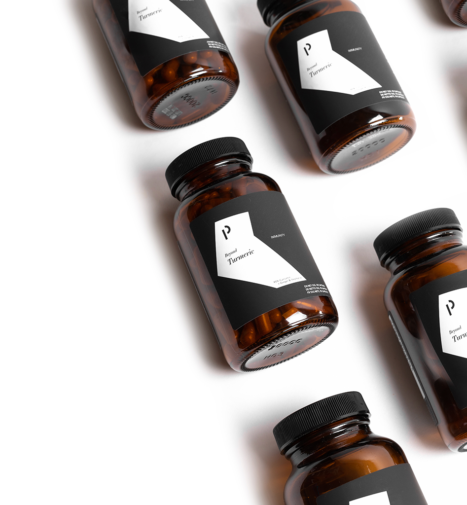
Product Design
The Packaging.
From the very beginning we wanted the packaging for the Primal Origin products to stand out amongst an already dense marketplace of supplements and elixirs. With that in mind, Crawford & John worked closely with Primal Origin’s founder to create packaging that not only looked phenomenal but also felt premium in your hand. We created a design system that would form a series of labels for the extensive and ambitious catalogue of products the company had in mind. As a result, the final products are not only eye-catching, but form an instant connection with the customer through tactile response due to a premium, texturised, stone-wash paper stock that surrounds the product.
From the very beginning we wanted the packaging for the Primal Origin products to stand out amongst an already dense marketplace of supplements and elixirs. With that in mind, Crawford & John worked closely with Primal Origin’s founder to create packaging that not only looked phenomenal but also felt premium in your hand. We created a design system that would form a series of labels for the extensive and ambitious catalogue of products the company had in mind. As a result, the final products are not only eye-catching, but form an instant connection with the customer through tactile response due to a premium, texturised, stone-wash paper stock that surrounds the product.