Call
+44 (0) 151 203 5834
The Logo Mark was developed with Supernova Living’s core team at every step of the way to ensure client satisfaction. C&J tailored the branding to be representative of core values of minimalism, forward-thinking and clear-cut vision. The final logo mark is simple, yet solid, soft yet strong, elegant, but bold.
The Logo Mark was developed with Supernova Living’s core team at every step of the way to ensure client satisfaction. C&J tailored the branding to be representative of core values of minimalism, forward-thinking and clear-cut vision. The final logo mark is simple, yet solid, soft yet strong, elegant, but bold.
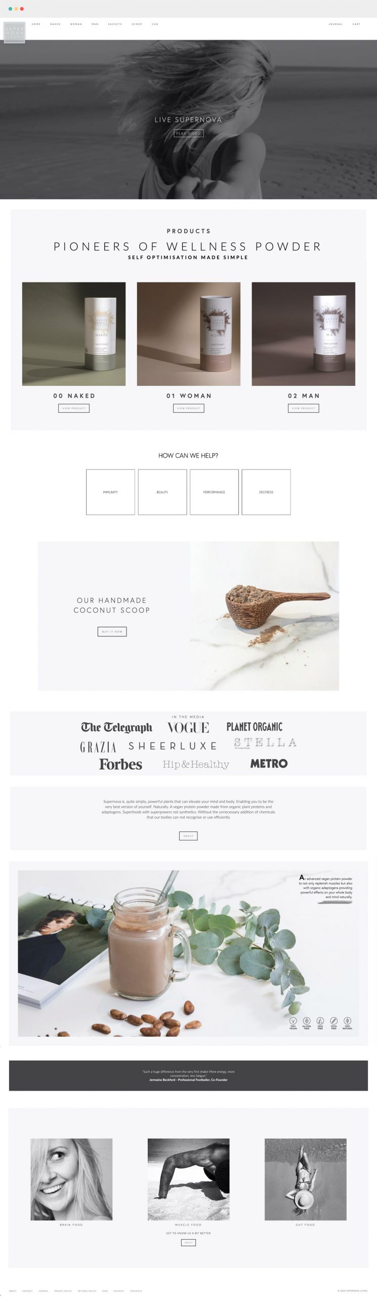
As a start-up, Supernova Living needed a site that was informative for new customers but also provided a place to shop and engage too. Crawford & John crafted a responsive e-commerce website, easy for Supernova Living’s team to keep up to date themselves, that allowed customers to shop and explore whilst providing their team key business tools such as inventory tracking, a stockists ordering system, affiliate marketing, GDPR compliance, email capture and more.
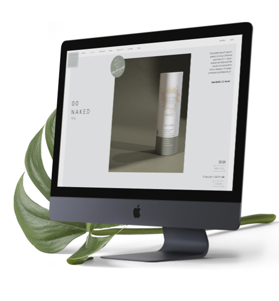
As a start-up, Supernova Living needed a site that was informative for new customers but also provided a place to shop and engage too. Crawford & John crafted a responsive e-commerce website, easy for Supernova Living’s team to keep up to date themselves, that allowed customers to shop and explore whilst providing their team key business tools such as inventory tracking, a stockists ordering system, affiliate marketing, GDPR compliance, email capture and more.
Minimal but impactful packaging. We were excited to create food packaging that stood out among the rest and that stepped away from generic re-sealable plastic bags and tubs of protein powder. Supernova Living shared this vision. After choosing a solid column card-tube to convey a sense of strength and stability, the next step was to build on the branding to deliver distinct outer packaging to showcase the product within.
Minimal but impactful packaging. We were excited to create food packaging that stood out among the rest and that stepped away from generic re-sealable plastic bags and tubs of protein powder. Supernova Living shared this vision. After choosing a solid column card-tube to convey a sense of strength and stability, the next step was to build on the branding to deliver distinct outer packaging to showcase the product within.